

A denial lands in your work queue. You know the reason code, the payer, and the dollars attached to it.
But do you know where the denial actually started? That’s a much harder question to answer.
The issue behind a denial may have happened well before the claim was submitted. It could trace back to registration, authorization, documentation, an order, or another point in the patient journey. When the same issue keeps happening, focusing only on each denial addresses what is right in front of you.
We needed a way to describe this deeper view of denial data, so at REDi Health, we gave it a name: topographic denial analysis.
The idea is simple. Much like a topographic map shows peaks and valleys, topographic denial analysis maps denial activity across your organization to show where it is concentrated. Instead of stopping at “Why was this claim denied?“, you can start asking, “Where is it coming from, and what can we learn from it?”
The goal is to turn those answers into action. When you can pinpoint the source of recurring denials, your team can focus improvement efforts where they matter most, prevent more denials before they happen, reduce unnecessary rework, and keep more revenue where it belongs.
What Is Topographic Denial Analysis?
At REDi Health, we developed the term topographic denial analysis to describe an approach to identifying where denial activity is concentrated across an organization.
Traditional denial analysis often focuses on what happened. Your team may already be reviewing denial reason codes, claim adjustment reason codes (CARCs), and remittance advice remark codes (RARCs) to understand why claims were denied. You might see that medical necessity denials are increasing, authorization issues are affecting revenue, or one payer accounts for a large share of your denials.
Topographic analysis adds another question: Where is it happening?
That could mean looking at denial activity across:
- Departments or service lines
- Locations
- Payers
- Procedures
- Workflows
The most useful view may look different at every rural hospital. One organization might find an important pattern by service line and procedure, while another sees something worth investigating when it looks at payer and location together.
For example, knowing that medical necessity is one of your top denial categories tells you there’s something worth paying attention to. Discovering that many of those denials are concentrated within one service line gives you a much more specific place to look.
Instead of one large bucket of denials, you have a map that points you to the areas that deserve attention.
But knowing where something is happening is only part of the picture. Next comes understanding why.
Denial Reason vs. Root Cause
Claim adjustment reason codes (CARCs) and remittance advice remark codes (RARCs) can tell you why a payer adjusted or denied a claim and provide additional details about that decision. But they don’t necessarily tell you what happened within your hospital’s processes that contributed to the denial.
That’s the difference between a denial reason and a root cause.
Take an authorization denial. The CARC may indicate that the required authorization wasn’t obtained, while an accompanying remark code provides additional information. But neither necessarily explains why the authorization was missing in the first place.
Was it never obtained? Did the service change after approval? Was there a communication breakdown between departments? Is the issue happening repeatedly with one payer or within one service line?
Those questions take you beyond what the payer reported and closer to understanding what actually happened. That gives your team better information to make meaningful changes and help prevent similar denials in the future.
Why Denial Rates Don’t Tell the Whole Story
Your denial rate is an important number. So are denied dollars, denial categories, payer trends, and appeal outcomes.
Together, these metrics can tell you a lot about the health of your revenue cycle. But for rural healthcare teams, there’s another question that matters just as much: Where should you focus your limited time and resources first?
When teams are small, and people are already wearing multiple hats, chasing every denial issue at once simply isn’t realistic.
Two hospitals could have the same denial rate but have very different stories behind that number. One may have denials spread across several areas, while another may see a concentration tied to a particular department, service line, or workflow.
And that doesn’t mean pointing fingers.
Seeing where a pattern occurs can create an opportunity to bring the people closest to that work into the conversation. They understand the day-to-day process in ways the data never will. The numbers can show you something is happening, while your team can provide the context that helps everyone understand it.
That gives rural healthcare leaders a more productive starting point. Instead of trying to tackle everything at once, they can focus on what will make the biggest difference and work with their teams to understand what the data shows.
For rural hospitals, the impact can extend well beyond the revenue cycle. Reducing preventable revenue loss can strengthen the hospital’s long-term financial sustainability, but the hospital itself is often a major part of the local economy. Keeping it financially strong can also mean supporting local jobs, services, and economic activity throughout the community.
What Can Topographic Denial Analysis Show You?
This is where the map starts to get interesting.
A high-level report might tell you that medical necessity denials are one of your biggest categories. A topographic analysis lets you narrow the view further.
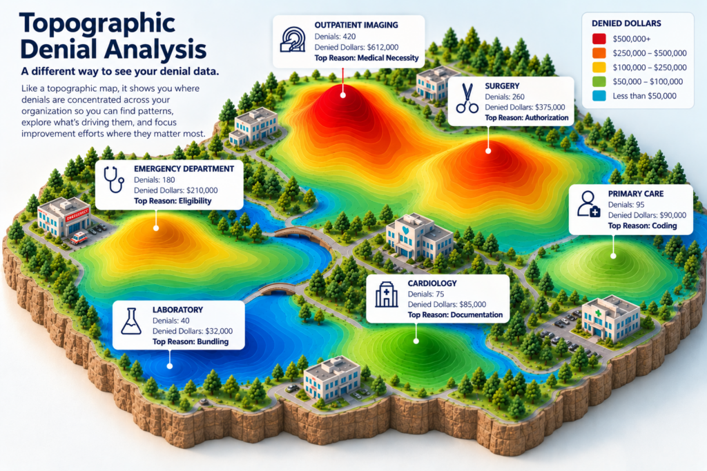
For example, you might discover:
- Medical necessity is a top denial category.
- A large share of those denied dollars is coming from outpatient imaging.
- CT scans account for much of that activity.
- Many of those claims are missing clinical information needed to support medical necessity.
- Reviewing the affected claims points to a recurring issue with how certain orders are being submitted.
Now you have something much more useful than “We have a medical necessity denial problem.”
You can see where the activity is concentrated and bring the right people into the conversation with something specific to explore together.
The data may also surprise you. An issue that appears widespread could be concentrated in one small area, while a less obvious pattern could drive a much larger financial impact.
That’s what makes the topographic view useful. It gives you another way to understand the story behind your overall denial numbers and see where you may have room to improve.
What Comes After You Find the Pattern?
Topographic denial analysis isn’t meant to provide every answer. It gives you a better place to start asking questions.
Once you can see where denial activity is concentrated, you can bring that information to the people who understand those processes best. Together, the data and their experience can empower your team to find a fuller picture of what is happening.
And sometimes what you learn may be unexpected.
What initially looks like a training issue could be related to a payer requirement. A problem that appears to affect an entire department could trace back to one small step in a workflow. Or a process everyone thought was working well may have changed over time.
That’s why the mapping matters.
It helps replace assumptions with better questions and gives your team something concrete to work from. What happens next will look different for every organization, but it starts with knowing where to look.
From Working Denials to Preventing Them
Denials will always require attention. But your team shouldn’t have to work the same issue in the work queue repeatedly.
For rural healthcare teams already wearing plenty of hats, working through a denial queue can take significant time. When so much attention goes to resolving past denials, it can be hard to step back and find the patterns behind them.
That’s where REDi Health can help do some of the heavy lifting.
We work alongside rural healthcare organizations to turn denial data into useful insight and fix denial issues at the root cause. Denials IQ identifies patterns and shows where denial activity is concentrated. When your organization is ready to take the next step, Denials Navigator can help you turn what you’ve learned into meaningful change.
The goal is simple: fewer preventable denials, less rework for your staff, and more revenue staying with your organization to strengthen financial sustainability and support the community that depends on it.
Ready to see what your denial data might be telling you? Contact REDi Health to start the conversation.